Typography in T-Shirt Design: Creating Impactful Text-Based Graphics for in T-Shirt Design: Creating Impactful Text-Based Graphics for in t-shirt design is the intentional use of type to communicate tone, personality, and message through apparel, and it drives how a shirt reads from across a room.
This article explains why text-based graphics matter for self-expression and merchandising, and it shows how font choices, custom lettering, layout, current trends, and print-on-demand workflows all combine to create memorable apparel. Many designers struggle with legibility, hierarchy, and print-ready files when translating type from screen to fabric; this guide offers "practical solutions" that preserve readability, style, and production fidelity. You will learn which font families work best for statement tees, how hand-lettering and scripts add emotional value, smart placement and sizing rules for front, back, and sleeves, what 2025 trends are shaping typographic tees, and how custom typography integrates with print-on-demand services for personalized apparel. Throughout, we highlight actionable tips—font pairing, spacing, mockup preparation, and production-friendly file specs—so you can design effective text-based graphic tees that print cleanly and resonate with wearers.
What Are the Best Fonts for Impactful T-Shirt Typography?
Choosing a font for a tee balances readability, tone, and print constraints: a great font is legible at distance, matches the shirt’s voice, and survives the chosen print method without losing detail. Sans-serif families excel for bold, modern statements because their simple forms maintain clarity at small and large sizes, while serif and display faces convey nostalgia or personality but require careful sizing. Typeface weight, x-height, and letter spacing directly affect visibility on fabric, and designers should always test fonts at intended print scale before finalizing art.
Research further supports the nuanced differences in legibility between serif and sans-serif fonts, highlighting factors like size thresholds and inter-letter spacing.
Serif vs. Sans Serif Font Legibility Research
assessed legibility using size thresholds and reading speed. Five percentage serif fonts were slightly more legible than sans serif, but the average inter-letter spacing increase that serifs
Below is a quick guide to the most useful font categories and their practical apparel use-cases.
Bold sans-serif: Best for short slogans and punchy statements where clarity matters.
Slab and vintage serifs: Ideal for retro looks and band-style tees that lean nostalgic.
Display and decorative: Use sparingly for short phrases or focal words to add character.
Script and hand-lettered styles: Great for names, signatures, and emotive phrases when sized and spaced correctly.
This list summarizes which font category suits common shirt goals and leads into specific technical comparisons you can apply when choosing type for a design.
Different font categories vary in readability, tonal fit, and common use-cases:
Font Category
Readability / Best Use
Emotional Tone
Sans-Serif (Bold)
High readability at distance; headlines and short slogans
Modern, direct, assertive
Slab/Serif (Vintage)
Moderate readability; larger sizes or short words work best
Nostalgic, sturdy, classic
Display & Decorative
Low readability at small sizes; short focal words only
Expressive, playful, distinctive
Script & Hand-lettering
Readable when high contrast and ample size; names/short quotes
Elegant, personal, handcrafted
This comparison helps you choose a font category by matching readability needs to the design’s emotional goals, and the next subsection explains how serifs and sans-serifs influence an apparel design’s voice and performance.
How Do Serif and Sans-Serif Fonts Influence Apparel Design?
Serif and sans-serif faces carry different historical and visual connotations that affect a tee’s perceived era and purpose. Serif fonts, with their small finishing strokes, naturally recall print heritage and vintage signage, making them effective for nostalgic or premium-feel apparel when used at larger sizes to preserve the serifs’ detail. Sans-serifs remove those strokes for cleaner shapes, which improves legibility at a distance and suits bold, modern statements or youth-focused streetwear. When preparing artwork for fabric, designers must increase stroke weight or choose a heavier variant of a serif if the printed size is small, because thin serifs can fill in or disappear in many print processes. Understanding these tendencies lets you match type to mood and printing reality, and the following subsection highlights display fonts designed specifically to create bold, attention-grabbing shirts.
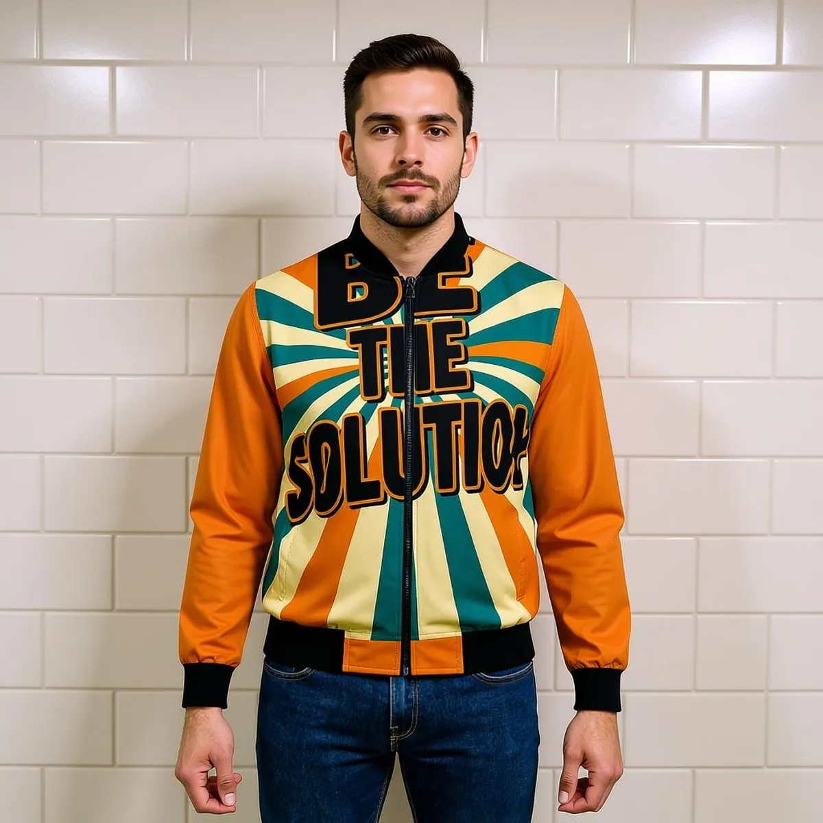
Which Display Fonts Make Bold Statements on Graphic Tees?
Display fonts are designed to carry personality and attract attention, and on apparel they work best for short headlines, band names, or single-word graphics where detail is visible. Styles like condensed sans displays, heavy slab displays, and retro script displays each evoke a distinct voice—condensed types read as urban and efficient, slab displays feel robust and vintage, while retro scripts bring period-specific charm. Because display fonts often include decorative terminals, ligatures, or textured fills, testing at intended print size and with your chosen print method (DTG, screen print, heat transfer) is critical to avoid loss of fine detail. Pair display faces conservatively—use a neutral sans or simple serif for supporting text—to keep hierarchy readable and prevent visual clutter in the overall layout.
How Can Creative Lettering Techniques Enhance T-Shirt Art?
Creative lettering turns ordinary type into a design element that carries story and style; it includes hand-drawn lettering, script treatments, calligraphy, and custom letterforms that are tailored to the message and garment. Custom lettering increases uniqueness, helps brand recognition, and creates emotional connection because every curve and stroke is deliberately crafted to match the sentiment of the phrase. From a technical perspective, hand-lettered art is sketched, refined, vectorized, and tested in mockups to ensure clean edges for printing, and it often requires additional time for kerning, outlines, and color separation compared with using a pre-made font. The next paragraphs break down the specific benefits of hand-drawn lettering and how scripts and calligraphy should be handled for fabric printing.
Indeed, studies suggest that hand-lettered type can significantly improve memorization compared to digitized typefaces, reinforcing its value in design.
Hand Lettering & Typeface Design for Memorability
Graphic designers have many choices when designing and communicating with words which can be seen throughout history. Hand lettering techniques have been used for centuries to record information. Then with the development of moveable type came the mass production of reading materials and the introduction of typefaces. Today, much written communication is viewed through a digitized typeface on a screen. However, there has recently been a noticeable increase in hand lettered type, one of these reasons being that hand lettered type can be easier for people to remember.Lettering Design: Using Handwritten and Illustrative Techniques to Improve Memorization, 2020
Unique voice: Custom letterforms avoid stock-looking solutions and make designs instantly recognizable.
Flexible composition: Lettering can be shaped to fit badges, circles, or custom paths for better layout control.
Emotional resonance: Organic strokes and irregularities communicate personality that standard fonts rarely achieve.
These benefits make hand-lettering a go-to strategy for designers who want distinct, emotionally resonant tees; the following subsection explains the hand-lettering workflow and its practical value.
What Are the Benefits of Hand-Drawn Lettering for Unique Apparel?
Hand-drawn lettering delivers originality and allows designers to tailor type to garment shapes, color palettes, and graphic elements, which strengthens brand identity and increases perceived value. The typical workflow—concept sketching → refinement → vectorization → print-ready separations—ensures that organic forms translate to crisp prints; vectorization removes jagged edges and provides scalable artwork for multiple garment sizes. Hand-lettered pieces also adapt well to distressing, texture overlays, and layered color effects that support vintage or artisanal aesthetics. Because custom lettering is unique, it can justify premium pricing or limited-run promotions, and designers should provide clear briefs and reference art when "collaborating with hand-letterers" to keep iterations efficient and production-ready.
This discussion of hand-lettering flows into how script and calligraphy styles can add flair while presenting specific legibility considerations.
How Do Script and Calligraphy Styles Add Artistic Flair to Tees?
Script and calligraphy bring an elegant, handcrafted vibe to apparel, making them ideal for names, short inspirational quotes, or decorative accents, but they require careful sizing and contrast to remain legible on fabric. Scripts with generous letter spacing and higher contrast between thick and thin strokes are more likely to reproduce well in screen printing and direct-to-garment processes; conversely, delicate hairlines and tight connections can clog or disappear during printing. Designers should avoid long paragraphs in script—reserve scripts for short phrases or as complementary elements—and test reversed (light text on dark shirts) and distressed treatments to ensure letterforms retain clarity. These practical script rules prepare you to balance beauty with production realities, and the next section explains placement and layout strategies that optimize visibility and hierarchy across garment areas.
What Are Effective Text Placement and Layout Strategies for Graphic Tees?
Effective placement and layout set visual hierarchy—headline, subhead, body—and determine how quickly a message reads and how it complements imagery on a shirt. Size, alignment, and safe margins are central: chest-centered headlines command attention, left-chest logos read as subtle brand marks, back designs allow for longer copy, and sleeve treatments serve niche branding or personalization. A consistent baseline grid and modular spacing system help maintain balance between text and imagery while ensuring type doesn’t interfere with seams, pockets, or printing tolerances. Below is a checklist of essential placement rules designers should follow, plus a comparison table mapping print locations to recommended font sizes and visibility.
Keep primary headlines large and centered or upper-chest for immediate visibility.
Reserve back panels for longer copy or larger graphics to avoid front clutter.
Use sleeve text for subtle branding only; keep it short and high-contrast.
Maintain at least 1–2" safe margins from seams and collar to prevent cropping.
Test contrast and sizing on actual mockups and garment colorways before approval.
This checklist defines core placement principles and leads into a structured comparison of print areas and their recommended typographic treatments.
Print Location
Visibility / Impact
Recommended Font Size & Use
Front Center (Chest)
High immediate impact; focal area
Headline: 48–120 pts depending on design; short slogans
Left Chest / Badge
Low-key, subtle branding
Small logos or names: 18–36 pts; keep short
Back Panel
High-area for extended copy or large art
Large headlines or multi-line copy: 60–180 pts
Sleeves
Low visibility; detail branding
Short text or numbers: 12–30 pts; high contrast essential
This table clarifies which locations suit different typographic purposes and transitions naturally into how to balance text with graphics for maximum visual impact.
How to Balance Text and Graphics for Maximum Visual Impact?
Balancing text and imagery starts with establishing a clear focal point so supporting text remains subordinate and legible; scale the headline to dominate while secondary type uses smaller sizes and restrained weights. Contrast—both color and weight—separates type from busy imagery, and negative space prevents the composition from feeling cramped, which is especially important on smaller chest areas. Designers should create layered mockups (flat + on-figure) to test how type interacts with folds, textures, and garment colors, then iterate spacing and stroke weight for better print outcomes. These balance techniques ensure the message remains readable in real-world wear, and the next subsection describes optimal typography locations and their practical pros and cons for production.
What Are the Best Typography Locations on Front, Back, and Sleeves?
Front center is the go-to for immediate message impact because it sits within the viewer’s natural sightline and supports headline-driven communication, whereas back prints enable longer narratives or bold imagery without crowding the chest area. Sleeves provide subtle branding opportunities—team numbers, small phrases, or personalization—best used sparingly and in high-contrast fonts to remain legible. When choosing locations, account for garment construction: pockets, zippers, and seams can encroach on artwork, so enforce safe zones and proof mockups on similarly sized shirts. This location-aware approach helps you pick the right spot for each message and prepares designs for efficient mockup-to-production handoff; the next section explores typography trends shaping tee design in 2025.
As a practical example for designers preparing product mockups, consider applying recommended typographic treatments to common product types such as t-shirts, hoodies, and sweatshirts; brands like "Catch Phrase Poet" use these formats frequently in their print-on-demand catalog to showcase text-driven designs and mockups.
Which Typography Trends Are Shaping Modern Graphic Tees in 2026?
In 2025, designers are blending retro revivals with bold, expressive typography and minimalist text treatments that emphasize message over ornamentation, while sustainability and storytelling influence type choices and messaging. Retro fonts from the 70s–90s, including slab serifs and period scripts, are resurfacing with authentic textures and muted palettes to evoke nostalgia. At the same time, oversized kinetic type, layered cuts, and experimental letterforms are gaining traction in streetwear for their attention-commanding qualities. Minimalist text-only apparel remains strong for affirmation and lifestyle brands, favoring sans-serif clarity and high-contrast palettes for versatile wardrobe staples. These trends suggest a split market: expressive statement pieces and clean, wearable basics both coexisting in consumer demand.
How Is Retro Typography Making a Comeback in Apparel Design?
Retro typography thrives by using era-specific letterforms—rounded scripts, condensed sans, and slab serifs—paired with muted, sun-faded palettes and texture overlays to simulate age. Distressing techniques, limited color separations, and halftone textures help mimic authentic vintage printing, and designers should deliberately soften edges and lower saturation to avoid overly literal reproductions. When using retro type, balance it with modern composition and fit to keep garments wearable for today’s audience. Understanding these visual cues ensures retro-inspired designs read as intentional and contemporary rather than costume-like.
This exploration of retro revival leads into new expressive trends that push typographic boundaries for 2025.
What Are the Emerging Bold and Expressive Text Trends?
Bold expressive trends include oversized type that dominates the garment, kinetic text that uses slanted baselines or layered offsets, and cut-out or negative-space techniques that create dimensionality. These approaches require rigorous print testing—overprinting, registration shifts, and color layering can introduce artifacts—so mockups and test screens are essential. Designers should also account for garment size variance: oversized type must scale harmoniously across S to XXL to avoid awkward cropping. By planning for production realities, expressive typographic experiments can translate from concept to wearable product without sacrificing print quality.
How Does Custom Typography Elevate Personalized Text-Based T-Shirts?
Custom typography transforms a t-shirt from mere clothing into a personal statement or a brand artifact by creating unique letterforms and layouts tailored to the wearer or campaign. Personalized type increases gifting value and emotional resonance, and custom fonts or hand-lettered phrases help small brands and creators stand out in crowded marketplaces. From a production standpoint, custom typography demands precise file prep—vector outlines, color separations, and verified safe areas—to ensure quality prints across different garments. The next subsections explain the print-on-demand workflow specific to typographic apparel and how customer stories illustrate the power of personalized text tees.
For entrepreneurial designers navigating the crowded online apparel market, custom typography offers a crucial way to establish a unique brand and stand out.
Online Apparel Business for Entrepreneurial Designers
With an incredibly dense online market existing and expanding, the capability of an entrepreneurial designer to sell their work and stand out from the crowd is an ever-growing problem. A small self-owned business can be easily lost in the web’s plethora of ads, get-rich-quick schemes, and content in general. Through case studies, secondary research, and visual research, the graduate student has attempted to thoroughly explore this online realm before executing what she believes to be a prosperous route to success. The word “success” here is referring to the creation of an appealing brand and designed products within the brand. Various online platforms allowing for a sole-owned business have been examined, among which the student believes she has found the best option that also allows for individuality.Dream It & Do It: A Look at the Online Apparel Business Market for Entrepreneurial Designers, 2019
"Catch Phrase Poet" operates as a print-on-demand brand that specializes in unique, artistic clothing and accessories for men, women, and children, focusing on meaningful, expressive designs. Their product mix typically includes t-shirts, hoodies, sweatshirts, tote bags, and ceramic mugs, all made-to-order with an emphasis on creativity, high-quality printing, comfort, and durability. Catch Phrase Poet positions unique and inspired designs, customized items, gifting value, worldwide shipping, and a creative community focus (family, pets, meaningful quotes) as "core benefits" that support designers and customers seeking personalized typographic apparel.
This brand example illustrates how custom typography pairs with POD practices to deliver unique text-based products and leads into the specific POD workflow designers and customers should expect.
What Is the Print-On-Demand Process for Unique Typographic Apparel?
Print-on-demand for typographic apparel typically follows a sequence: design creation, vectorization and file prep, mockup approval, production printing, and made-to-order fulfillment; each step protects typographic fidelity from concept to garment. Designers should supply vector files (outlined type in EPS or PDF), use CMYK color modes where required, and include bleed and safe-area margins to avoid cropping during printing. Quality checks often involve approving on-garment mockups and requesting test prints for complex layering or distressed effects. For customers, this means providing clear text, preferred fonts or lettering samples, and color references to streamline production and reduce revision cycles.
POD steps, typical file requirements, and what customers should provide are summarized below:
Workflow Phase
File / Turnaround Attributes
Customer Deliverables
Design & Prep
Vector outlines, high-res art, CMYK or spot colors
Finalized text, font choices, color references
Mockup & Approval
On-garment preview; revise for sizing and placement
Mockup approval or feedback within production window
Production & Fulfillment
DTG or screen printing depending on order; made-to-order fulfillment
Acceptance of print proof; note on personalization details
This table clarifies expectations for each POD phase and helps customers prepare assets that reduce delays; the following subsection highlights how real customer stories show the emotional impact of personalized text tees.
How Do Customer Stories Reflect the Power of Personalized Text Tees?
Customer anecdotes consistently show that personalized text tees function as memorable gifts, rallying items, and keepsakes because the typography itself embodies the sentiment—names, dates, and inside jokes rendered in a carefully chosen type can create strong emotional resonance. Case examples often involve celebratory designs (birthdays, reunions) and small-batch merch for "niche communities", where custom lettering cements identity and belonging. Brands using POD can feature customer-provided copy in a controlled workflow that verifies legibility and placement before printing to avoid disappointment. These stories demonstrate that good typographic design, paired with reliable POD execution, elevates shirts from commodities to cherished items.
Community Merchandise: Custom typography cements group identity.
Keepsake Apparel: Thoughtful type choices transform shirts into lasting mementos.
These examples show the emotional and commercial advantages of custom typography in wearable design and complete the practical guidance designers need to execute typographic tees that print well and connect with wearers.
Skip the generic band tee. Here are 12 pieces of apparel for the music lover in your life that go deeper — bold graphics, real messages, and quality that holds up through every show.
Motivational Graphic Tees to Wear What Gives You Drive and Connection
, Catch Phrase Poet
Wearing motivational graphic tees is more than just a fashion statement; it's a declaration of personal empowerment and connection. These unique pieces of urban wear help individuals express their personalities while embedding positive affirmations into their daily lives. By donning apparel that inspires, wearers can enhance their motivation and foster deeper social connections. This article will explore the varied ways motivational tees can uplift the spirit and promote personal expression and community bonding. We will analyze how these tees inspire, what makes Catch Phrase Poet’s designs special, and how to style them effectively to maximize their impact. Additionally, we will highlight the benefits of wearing such urban streetwear and share compelling stories from wearers who have found their drive through these garments.
How Do Motivational Graphic Tees Inspire Drive and Social Connection?
Motivational graphic tees inspire individuals by serving as a medium for self-expression while also promoting social connection. The visual elements, such as their bold designs and catchy phrases, evoke feelings of empowerment and communal belonging. Effective design examples, such as impactful catchphrases, resonate with the wearers and their communities, thereby fostering engagement and conversation. This can lead to encouragement and support systems within shared spaces. Moreover, the psychological impacts on wearers often include increased self-esteem and motivation to pursue personal goals. By wearing these tees, individuals not only motivate themselves but also inspire those around them, creating a ripple effect of positivity and connection.
What Makes Catch Phrase Poet’s Urban Streetwear
Designs Unique?
Catch Phrase Poet stands out in urban streetwear with its distinct approach to apparel that marries aesthetic appeal with motivational messaging. The integration of artistic designs with uplifting catchphrases sets the brand apart, tapping into the desires of consumers for both style and substance. The target audience ranges widely, appealing to individuals looking to express their personalities creatively while promoting positive affirmations. Moreover, the sustainability and quality of materials used in Catch Phrase Poet’s clothing emphasize a commitment to environmental consciousness and longevity, ensuring that every purchase also supports ethical fashion. Explore the full range of unique designs at their collections.
How Do Expressive Apparel Pieces Foster Personal Motivation?
Expressive apparel, particularly motivational graphic tees, plays a critical role in fostering personal motivation. Wearing clothing that features affirmations or motivational slogans can serve as a daily reminder of one’s aspirations and values. This phenomenon is not merely about aesthetics; it embodies the idea of wearable activism through clothing. Individuals often find that these pieces encourage them to stay focused on their goals and inspire others in their community to do the same. The act of wearing motivational apparel becomes a personal commitment to maintaining a positive mindset and actively pursuing self-improvement.
How Can You Style Positive Affirmation Clothing to Spark Connection?
Styling positive affirmation clothing is about more than just throwing on a tee; it involves creating outfits that reflect the messages behind the apparel and encourage connection with others. Here are some tips for styling these motivational wearables:
Choose Impactful Messages: Select tees featuring messages that resonate with your personal values and beliefs. This creates a greater connection when engaging with others.
Layer Thoughtfully: Consider layering motivational tees under jackets or over long-sleeve shirts to create depth and versatility in your look.
Accessorize with Intent: Incorporate accessories such as hats, bags, or jewelry that align with the positive messages of your clothing to enhance the overall impact.
These styling techniques not only elevate personal wardrobe choices but also promote discussions and connections with others who share similar values.
What Are Top Ways to Combine Witty Slogan T Shirts with Everyday Wear?
Combining witty slogan t-shirts with everyday wear can inject personality and creativity into any outfit. Here are several effective ways to incorporate motivational tees into your daily attire:
Smart Casual Ensembles: Pair your motivational tee with tailored trousers or a chic skirt for a polished, yet relaxed look suitable for casual workdays or outings.
Jeans and Sneakers: For a comfortable and classic vibe, wear your tee with your favorite jeans and casual sneakers, making it perfect for weekend activities.
Layered Looks: Utilize a motivational tee as a base layer, adding a light jacket or cardigan on top for added style and versatility.
These combinations not only promote personal expression but also allow wearers to convey their motivations in various settings.
Which Accessories Enhance the Message of Motivational Urban Wear?
Accessories play a vital role in complementing the message conveyed by motivational urban wear. Here are a few accessory ideas that can enhance your outfit:
Motivational Jewelry: Jewelry featuring inspirational quotes or symbols can effortlessly align with the messages of your tee, creating a cohesive and thoughtful look.
Functional Bags: Opt for bags that carry positive affirmations, serving both practicality and style while promoting the same uplifting messages as your clothing.
Statement Hats: Consider hats that echo the spirit of your apparel, whether with graphics or phrases that resonate with your identity and motivations.
By carefully selecting accessories, individuals can further express their commitments to positivity and motivation.
Why Choose Expressive Apparel For Women and Kids to Boost Confidence?
Expressive apparel for women and children serves a purpose that extends beyond style; it fosters confidence and promotes self-acceptance. The psychological impact of positive messaging in clothing is profound, as it encourages both self-expression and body positivity. Styles designed for women's and children's unique preferences help create a sense of belonging in community spaces. By wearing motivational messages, wearers discover their individuality in a supportive environment, fostering social connections that bolster confidence. As children and women engage with this apparel, they cultivate a positive self-image that encourages them to embrace their uniqueness. You can find a dedicated range of apparel for women and children's clothes designed to do just that.
How Does Positive Affirmation Clothing Support Mental Wellness and Style?
Positive affirmation clothing merges mental wellness with style in an impactful way. Wearing messages that promote mental health awareness can serve as a daily reminder for individuals to prioritize their emotional well-being. The psychological benefits of wearing affirmations include enhanced mood and increased resilience during challenging times. Moreover, styling these affirmation pieces can act as a sense of armor against negativity, promoting feelings of strength and positivity. The synergy between mental wellness and fashion highlights how positive clothing can significantly bolster emotional health while allowing individuals to express their personal style.
What Stories Do Customers Share about Wearing Catchphrase Apparel?
Customers frequently share transformative experiences related to their connection with Catch Phrase Poet's apparel. Individuals report that wearing a motivational tee has sparked conversations with strangers, leading to unexpected friendships and community bonds. Many wearers express how the presence of positive messages in their daily outfits serves as a source of inspiration during tough moments, helping them to navigate challenges with a greater sense of purpose. Personal anecdotes highlight the brand's impact on fostering community connections and individual empowerment, illustrating the strength of wearing motivational clothing.
What Are the Benefits of Wearing Urban Streetwear with Motivational Messages?
Wearing urban streetwear adorned with motivational messages provides numerous benefits that enhance personal and social well-being. Some key advantages include:
Enhanced Personal Motivation: Motivational apparel encourages wearers to stay focused on their goals and aspirations.
Fostering Social Connections: Clothing with positive affirmations can serve as conversation starters, promoting connections among individuals with shared values.
Encouraging Self-Expression: These graphic tees allow wearers to express their personalities openly, reinforcing their identities in a public setting.
Acknowledging these benefits underscores the power of urban streetwear to not only make a fashion statement but also to empower and connect individuals on a deeper level. For a wide selection of these empowering pieces, visit all available items.
Building a Capsule Wardrobe with Purpose: Essential Minimalist Streetwear Pieces That Inspire Daily GratitudeCreating a capsule wardrobe is not just about minimalism; it's about intentionality and self-expression. A well-curated collection of streetwear pieces can inspire daily gratitude and reflect personal values. This article will guide you through the essential streetwear items that form a purposeful capsule wardrobe, emphasizing how motivational catchphrases can enhance your style and mindset. Many individuals struggle with cluttered wardrobes and the challenge of expressing their individuality through fashion. By focusing on essential pieces, you can simplify your choices while promoting a positive outlook. We will explore the key streetwear items, the psychological benefits of motivational apparel, and practical steps to build your intentional wardrobe.Indeed, the psychological underpinnings of fashion, particularly streetwear, play a significant role in shaping identity and motivation.
Streetwear Psychology: Identity & Motivationtheories of consumer psychology as documented in figures along with psychological components shaping identity s experiences and motivation in the world of streetwear.Streetwear: What is the Hype about, 2020What Are the Essential Streetwear Pieces for a Purposeful Capsule Wardrobe?A purposeful capsule wardrobe consists of versatile pieces that can be mixed and matched to create various outfits. Essential streetwear items include fitted base layers, oversized outer layers, and graphic tees with motivational messages. These pieces not only provide comfort and style but also serve as a canvas for self-expression.
Essential Piece
Description
Purpose
Fitted Base Layers
These are snug, comfortable tops that can be worn alone or layered.
They provide a solid foundation for any outfit.
Oversized Outer Layers
Jackets or hoodies that offer a relaxed fit.
They add dimension and style while keeping you warm.
Graphic Tees
T-shirts featuring motivational catchphrases.
They inspire positivity and self-expression.
This selection of essential pieces allows for creativity in styling while maintaining a minimalist approach.Which Minimalist Streetwear Essentials Define an Intentional Urban Wardrobe?An intentional urban wardrobe is characterized by key essentials that promote versatility and sustainability. Oversized silhouettes, neutral bottoms, and sustainable materials are fundamental to this style.
Oversized Silhouettes: These pieces provide comfort and a relaxed aesthetic, making them easy to wear for various occasions.
Neutral Bottoms: Tailored trousers or joggers in neutral colors can be paired with almost any top, enhancing the versatility of your wardrobe.
Sustainable Materials: Choosing clothing made from eco-friendly fabrics supports the environment and aligns with the values of conscious consumerism.
By focusing on these essentials, you can create a wardrobe that is both functional and stylish.How Do Motivational Catchphrases Enhance Streetwear Apparel?Motivational catchphrases on streetwear serve as powerful tools for self-expression and community engagement. They allow individuals to communicate their values and beliefs through their clothing choices.
Self-Expression Through Clothing: Wearing graphic tees with meaningful messages can reflect personal philosophies and inspire conversations.
Community Engagement: Apparel featuring shared values fosters a sense of belonging among like-minded individuals.
Marketability of Apparel: Brands that incorporate motivational messages often resonate more with consumers, creating a loyal customer base.
These elements highlight the importance of choosing apparel that not only looks good but also feels good on a deeper level.How Do Motivational Catchphrases Inspire Daily Gratitude Through Fashion?Fashion can be a powerful medium for promoting gratitude and positivity. Motivational catchphrases serve as daily reminders of personal values and aspirations, encouraging self-reflection and mindfulness.Research further supports the profound connection between fashion choices and an individual's overall psychological well-being.
Fashion & Well-Being: Boosting Mood and Self-ConceptThis chapter takes a positive psychology approach to dress and fashion. It presents and discusses existing literature on how people’s conceptualisation of and relationship with fashion influence their well-being across the lifespan. Using an empirical approach, the authors discuss the different ways in which fashion and clothing can boost psychological well-being on different levels, for instance, mood, emotions, happiness, quality of life, creativity, and relationships with others. In addition, they examine how fashion may enable people to develop a positive self-concept and thrive on a psychological level.The Impact of Fashion and Clothing on Well-Being: A Positive Psychology Approach, 2018What Psychological Benefits Do Motivational Streetwear Pieces Provide?Wearing motivational streetwear can lead to several psychological benefits, enhancing overall well-being.
Self-Expression: Clothing that reflects personal beliefs fosters a sense of identity and authenticity.
Increased Confidence: Wearing pieces that resonate with one's values can boost self-esteem and confidence.
Sense of Belonging: Engaging with a community that shares similar values through fashion can create a supportive network.
These psychological benefits illustrate how clothing can influence mental health and personal growth.This perspective is further elaborated by studies exploring the deeper psychological motives and social implications embedded within various fashion trends, including streetwear.
Streetwear & Identity: Psychological Motives in FashionDrawing on interdisciplinary research from marketing, psychology, and evolutionary theory, we interpret various luxury fashion trends by identifying the psychological motives and social implications underlying them. We present these trends under the notion offashion codes:the Conspicuous Code,Wall Street Code,Sugar Baby Code,Streetwear Code,Responsible Code,Outlaw Code, andInconspicuous Code. Each code represents a distinctive set of styles and symbolic meanings that serve specific psychosocial functions, such as signalling wealth, status, competence, attractiveness, morality, or uniqueness. By organising this complex landscape, the chapter sheds light on how luxury fashion enables consumers to navigate social hierarchies, express identity, and fulfil evolving psychosocial needs.The Psychology of Luxury Fashion Consumption, F Morhart, 2026
How Does Expressive Apparel Foster Individuality and Self-Expression?Expressive apparel, particularly those featuring unique designs and motivational messages, plays a crucial role in fostering individuality.
Unique Designs as a Canvas for Identity: Customizable options allow individuals to showcase their personality through fashion.
Customization Options: Many brands offer personalized apparel, enabling consumers to create pieces that truly represent them.
Community Connection: Wearing expressive clothing can spark connections with others who share similar values or aesthetics.
This connection between fashion and identity emphasizes the importance of choosing pieces that resonate personally.How to Build an Intentional Capsule Wardrobe Using Catch Phrase Poet’s Streetwear?Building a capsule wardrobe with purpose involves selecting versatile pieces that align with your values. Catch Phrase Poet offers a range of streetwear that embodies this philosophy, making it easier to curate your collection.What Steps Create a Minimalist Urban Wardrobe with Purpose?To create a minimalist urban wardrobe, consider the following steps:
Master Layering Techniques: Layering allows for versatility in styling, making it easy to adapt outfits for different occasions.
Utilize Graphic Tees: Incorporate motivational graphic tees as statement pieces that can elevate any outfit.
Research Sustainable Brands: Prioritize brands that align with your values, ensuring your wardrobe reflects your commitment to sustainability.
These steps will help you build a wardrobe that is both functional and meaningful.How to Integrate Unisex and Children’s Streetwear Essentials Effectively?Inclusivity in fashion is essential for a truly intentional wardrobe. Here are strategies for integrating unisex and children’s streetwear essentials:
Emphasize Sustainability: Choose pieces that are made from eco-friendly materials, suitable for all ages.
Incorporate Gender-Neutral Styles: Select styles that can be worn by anyone, promoting inclusivity and versatility.
Engage with the Audience: Foster a community around your wardrobe choices, encouraging discussions about style and values.
By focusing on inclusivity, you can create a wardrobe that resonates with a broader audience.What Styling Tips Elevate Expressive Capsule Wardrobes with Motivational Apparel?Styling expressive capsule wardrobes requires creativity and an understanding of how to mix and match pieces effectively.How to Mix and Match Intentional Fashion Pieces for Daily Wear?Mixing and matching intentional fashion pieces can enhance your daily outfits. Here are some tips:
Experiment with Textures: Combine different fabrics to create visually interesting outfits.
Use Statement Pieces: Incorporate bold items, like graphic tees, to serve as focal points in your outfits.
Consider Fit and Comfort: Ensure that your clothing fits well and feels comfortable, as this will enhance your confidence.
These tips will help you create stylish and intentional outfits that reflect your personality.Which Accessories Complement a Minimalist Streetwear Capsule?Accessories play a vital role in elevating a minimalist streetwear capsule. Consider these options:
Statement Jewelry: Bold pieces can add flair to simple outfits, making them stand out.
Unique Footwear: Shoes can define an outfit; choose styles that reflect your personal aesthetic.
Hats and Bags: Functional accessories can enhance your look while providing practicality.
Incorporating these accessories will complete your capsule wardrobe and enhance your overall style.Why Choose Motivational Streetwear Brands for Sustainable and Purposeful Fashion?Choosing motivational streetwear brands aligns with a commitment to sustainability and self-expression. These brands often prioritize ethical practices and meaningful messaging.How Does Catch Phrase Poet Align with Minimalist and Sustainable Fashion Trends?Catch Phrase Poet exemplifies the principles of minimalist and sustainable fashion through its commitment to quality and eco-friendly materials. The brand focuses on creating pieces that are not only stylish but also promote positive messages.
Use of Eco-Friendly Materials: The brand sources sustainable fabrics that reduce environmental impact.
Ethical Production Practices: Catch Phrase Poet ensures fair labor practices in its manufacturing processes.
Artistic Intent in Designs: Each piece is designed with a purpose, encouraging wearers to express their individuality.
This alignment with sustainable practices makes Catch Phrase Poet a compelling choice for conscious consumers.What Role Do Brand Messaging and Catchphrases Play in Consumer Empowerment?Brand messaging and catchphrases are crucial in empowering consumers. They serve as reminders of personal values and aspirations, fostering a sense of community and belonging.
Non-Verbal Communication Through Clothing: Apparel can convey messages that resonate with personal beliefs.
Fostering Community: Wearing brands that share your values can create connections with others.
Enhancing Self-Acceptance: Motivational messages can inspire individuals to embrace their identities and values.
This empowerment through fashion highlights the importance of choosing brands that align with personal beliefs and values.Shop Purposeful StreetwearBuild a wardrobe with purpose using streetwear from Catch Phrase Poet. Discover our urban wear unisex t-shirts and unisex hoodies & sweatshirts that inspire daily gratitude. Browse all products or design custom inspirational streetwear.